The Monte Carlo simulation is a mathematical technique that allows you to account for risk in quantitative analysis and supports decision-making. It relies on a large number of random simulations based on historical data to project the probable outcome of future projects under similar circumstances.
From the project manager’s perspective, the simulation takes the throughput data of their team’s workflow for a past time frame of their choice (e.g., January 3rd - February 3rd) and tries to predict what the throughput data for the same team will look like in the future (e.g., February 4th - March 4th).
For any day in the future for which you want to project results, the statistical equation will use the characteristics of a random workday in the past time frame to simulate several options of how many work items the team is likely to get done on the day in the future.
For example, on January 7th, you had a throughput of 10 tasks from your Kanban board. The simulation takes this number and assumes that this is how many assignments will be completed on February 4th. To project the probable throughput of February 5th, it takes the throughput of another random day and repeats this process for the remaining days of the time frame.
The simulation is repeated a few thousand times before the results are presented in the form of a probability distribution so that you can be certain that the prediction will come true. This format shows a statistical function describing all the possible values that a variable might take and the likelihood of that happening within the given range.
Use the two Monte Carlo Simulations to anticipate how many tasks your team can finish for a given time period or when a certain number of tasks might be completed
Basically, you are using as much historical data as you need to project what the future might look like. Probability distributions are a much more realistic way of describing uncertainty in risk analysis variables.
Since the Monte Carlo simulation's introduction in the middle of the 20th century, it has proven to be a very realistic way of presenting probability without shooting in the dark. It is regarded as one of the most popular ways of forecasting in project management.
The 'How Many' Monte Carlo Chart
 Monte Carlo: How Many Simulations
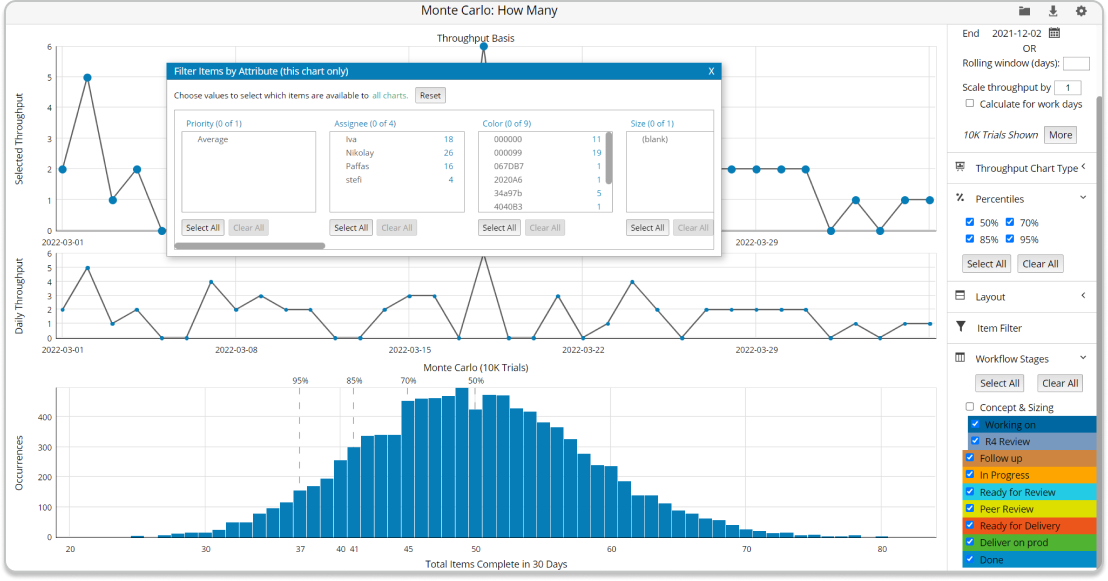
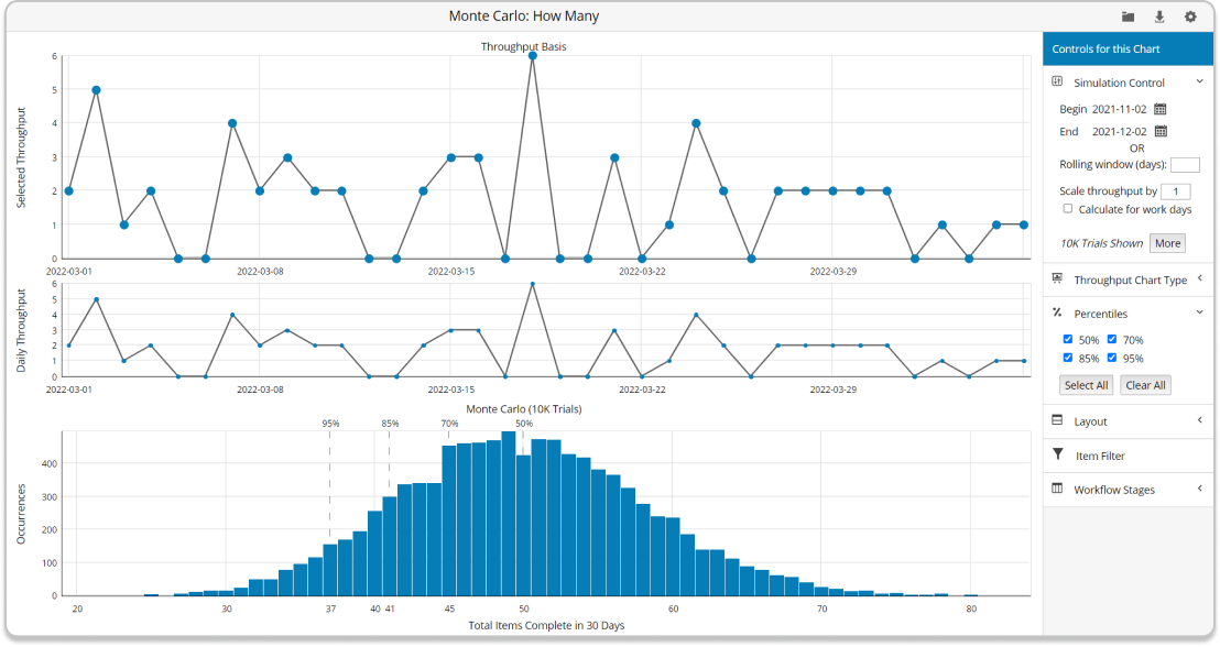
The 'How Many' Monte Carlo chart aims to tell you the minimum number of items that you can complete within the next “x” days. For example, you can use it if you’ve got a product update scheduled for March 5th and wish to know how many features you can finish by then.
At first sight, you will notice that the 'How Many' Monte Carlo chart consists of three charts:
- Throughput Basis
- Throughput Navigator
- Monte Carlo

At the top is the Throughput Basis chart. The vertical axis shows the daily throughput of tasks over the defined time frame.
The low points of the chart represent the minimum number of tasks completed in a single day (e.g., zero), while the high points represent the maximum throughput of any of the days in the range. The horizontal axis is a chronological visualization of the time frame for which the chart displays data.
Each dot on the chart represents the throughput of a single day within the frame. Hovering over any of them will give you synthesized information about the number of cards completed during that day. The dots are connected with a line to visualize the rises and drops in productivity between the days included in the visualization more clearly.
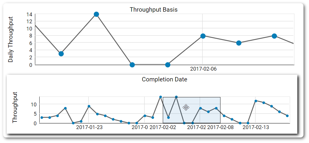
The throughput navigator has a similar function as its equivalent in the Cycle Time Scatterplot and Histograms. It allows you to zoom in and out of a specific interval within the selected time frame.
Once again, you can slide the frame around by clicking on the navigator's interface. This way, you can generate different Monte Carlo simulations without having to reset the general time frame every time.

The bottom chart in the view is where the magic happens. It is a direct visualization of the simulation's results in the form of a probabilistic distribution. The horizontal axis visualizes the total work items that will probably be completed within the selected future time frame. The vertical axis shows how many instances of a certain result occurred during the trials.
The Monte Carlo simulations in Businessmap will run 10k trials to maximize the accuracy of their results. In other circumstances, a simulation may run fewer trials, depending on the scenario.
The percentiles decreasing from left to right at the top edge of the chart represent the probability of any of the simulation results visualized below realizing itself within the future time frame.

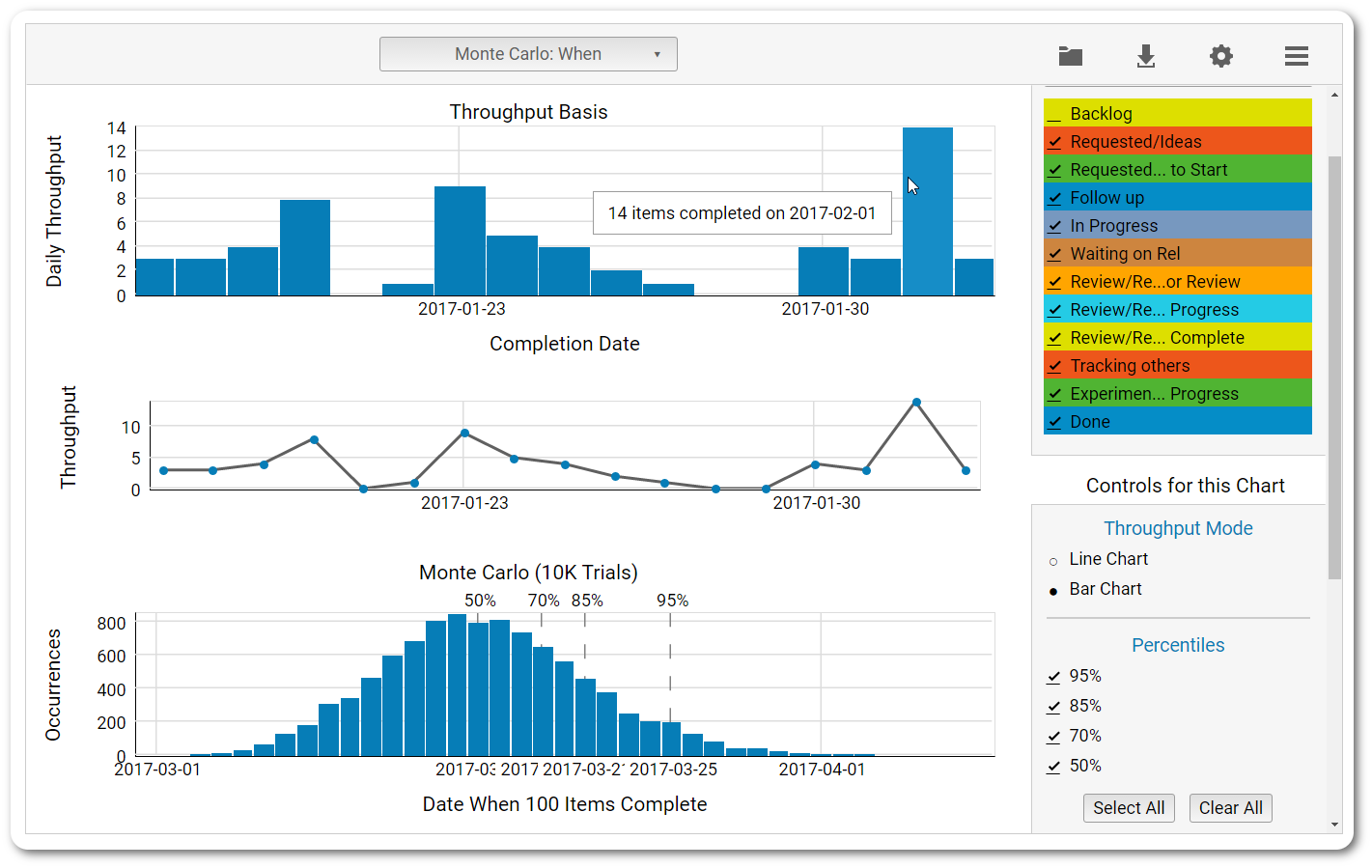
When you hover over the chart with your cursor, you’ll receive summarized information about different intersecting points on the chart.
The 'When 'Monte Carlo Graph
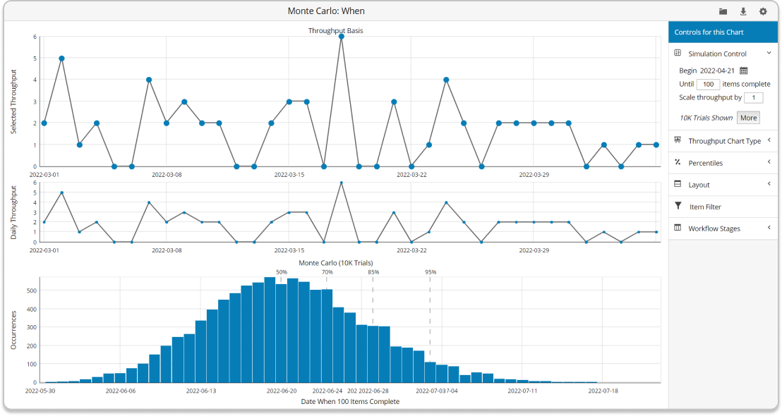
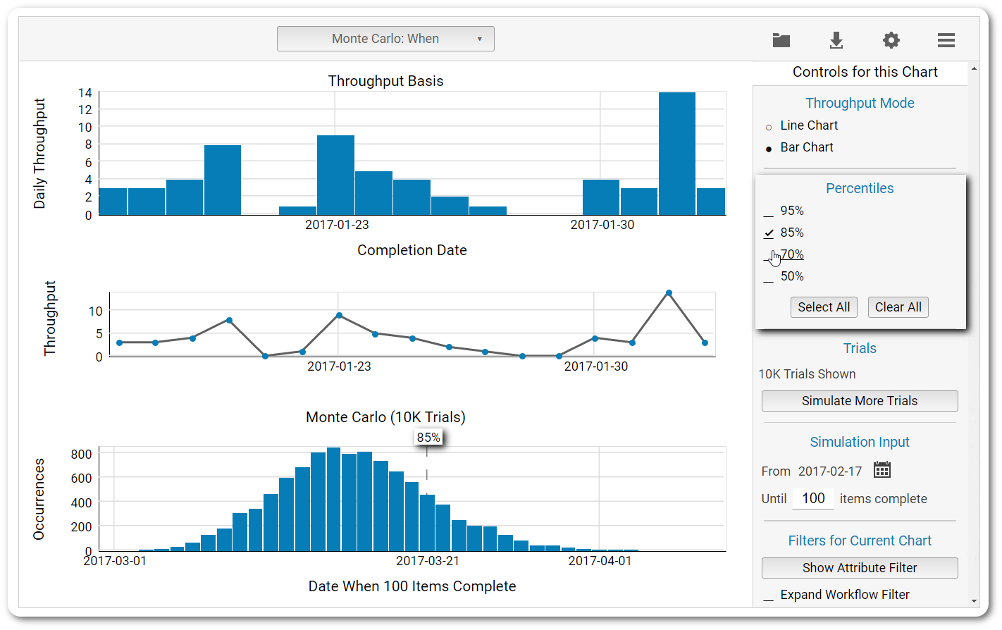
The second Monte Carlo graph featured in the analytics module has a single purpose—to tell you when you can expect the team to finish a specific number of assignments that you have yet to start working on.
It has an identical structure to the 'How Many' and works similarly. The only structural difference concerns the significance of the percentiles that line the last chart in the view.
Unlike in the 'How Many' Monte Carlo graph, they increase from left to right instead of decreasing. This refers to the fact that the further you go in time, the greater the certainty of the 100 work items upon which the simulation is based to be completed.
NOTE: It is important to note that if the characteristics of the team that generated the historical data change (e.g., a new team member is added), the simulation produced from the data will no longer be valid.
The Monte Carlo: When can be extremely useful for portfolio management. For example, when you are trying to plan your feature development roadmap for the next six months, you can open your dedicated project board and filter the number of features you wish to see completed and the starting date of your simulation.
Visualize Precisely What You Want to See with the Agility of Monte Carlo Filters
Like most of the other components in the two forecasting charts, the filters for the Monte Carlo: When and Monte Carlo: How Many simulations are nearly identical.
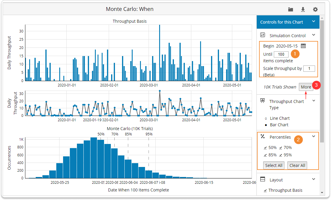
With the help of the Simulation Control functionality, you can define the future time frame for which you would like to generate a forecast. This is the only filter that is slightly different between the two charts.
In the Monte Carlo: How Many simulations, the filter will allow you to select a start and end date of your future prediction, while in the Monte Carlo: When simulation, you’ll be able to define a starting date and pick any number of tasks for which you want to generate a likely completion date.
The Item Filter at the bottom of the menu allows you to run a very specific simulation based on pre-selected attributes from your board setup.
For example, you may include just the cards with high priority in the historical data and see how many cards (unfiltered) will be completed for the rest of the quarter.
*This filter is global for all analytics and will apply the same filter criteria if you choose to switch between the different charts.
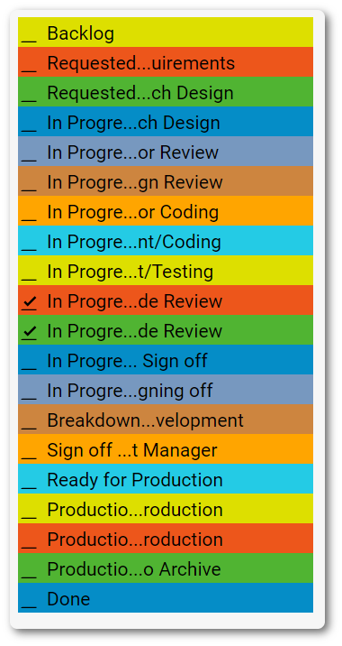
You can include and exclude different workflow stages from the historical data to experiment with different possible conclusions.
For example, you can remove the requested section of your workflow and predict how many cards can go from an activity column, such as Coding, to a queue column of the process (e.g., ready for code review) in a pre-selected period of time in order to anticipate how many cards will pile up if there is no one to process them.
Switching the throughput mode is possible as well. If the line chart is not to your liking, there is a histogram view that may prove to be more convenient for you.
The next filter allows you to add/remove the percentiles from your simulation. For example, if you are interested in seeing where there is an 85% chance for the prediction to come true, remove the checkmarks from the rest of the available percentiles to focus only on your target.
If you can’t be convinced that the prediction will come true by the default 10K trials, you can run up to 1M trials with a single button click. The results won’t change dramatically, but the curve of the chart will become smoother. To stop the trials, release the button by clicking on it again.
The last filter is designed to give you а different perspective by removing any card attribute of your choice from the prediction and different stages of the workflow. In combination with the filter for the past time frame, it will allow you to make very specific predictions.
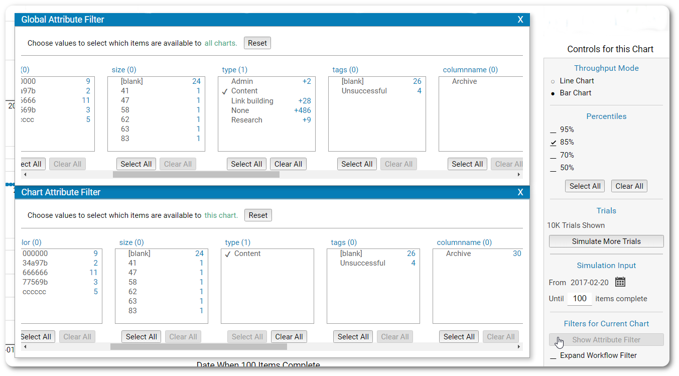
For example, let’s say that you are about to launch a new marketing campaign and have already prepared the breakdown of the tasks that need to be completed. You’ll probably want to know when the content for the campaign will be ready.
To find out, select the specific card type in both filters. The platform will exclude the rest from the simulation, thus giving you a more precise prediction based only on your previous content performance.
These are just a few ways you can apply the Monte Carlo simulations to analyze your workflow and make forecasts about it based on the historical data collected from your team.
Try Businessmap Free for 14 days
Alex Novkov
Content Lead
Energetic and practical, passionate about social media, creative writing, heavy weights, and outdoor activities.


