Establishing a stable workflow is the key to building successful and productive teams. A stable workflow helps your organization deliver faster to market and brings greater value to your customers.
But how can you measure and improve the success rate of your workflow?
The answer is simple - with statistically significant data. Using Kanban metrics is necessary for understanding how your team is performing and where they need to improve. This is why most of the contemporary online Kanban solutions are equipped with powerful analytics modules that provide you with valuable workflow metrics.
With Kanban metrics, you don't need to guess when project work will be done, as they give you hard data on the productivity, efficiency, and reliability of your production process.
Here is why you can consider these as team productivity metrics and process efficiency reporting.
Now, let's discover which of the essential Kanban reporting metrics you need to know.
Lead Time and Cycle Time
Lead time and Cycle time are two of the most important and useful Kanban metrics. They can help you understand how long work items stay in your workflow until they are completed. Lead time is the total amount of time a task spends from order to delivery in your system. Cycle time is the amount of time you spend actively working on it.
People often confuse these two workflow metrics, but there is a clear difference. The lead time starts from the moment a new task is requested and ends when it is done. On the other hand, the cycle time begins when someone actually starts working on a given assignment. In other words, cycle time starts from the commitment point.
Both metrics are essential because they can show you how long it takes for work to flow through your value stream.
You can use lead time data to analyze if work items wait for too long before they enter in progress. On the other hand, cycle time metrics help you understand the amount of time needed for the actual completion of a given task.
See work. Fix flow. Deliver faster.
How to measure Cycle time and Lead time?
To measure the average cycle time and lead time, you can use a Cumulative Flow Diagram - one of the most advanced data sources for your workflow. The CFD can show you the average cycle time and lead time, as well as the number of work in progress items. This way, you can see how stable your workflow is and where you need to improve.
→ Learn more about CFD
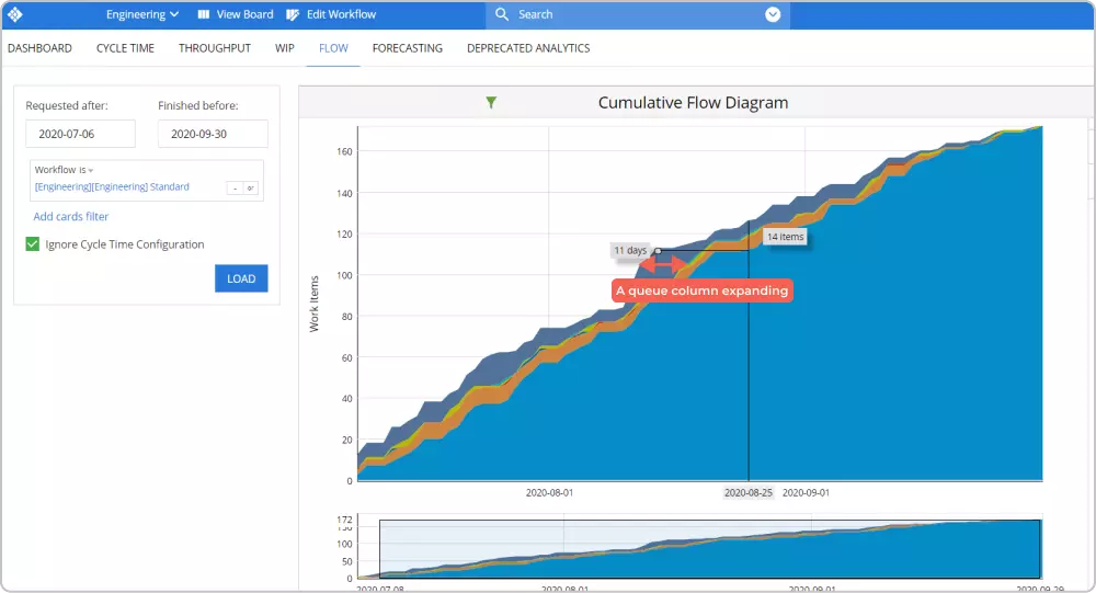 Cumulative flow diagram
If you want to analyze the cycle time of individual work items, you can use the Cycle Time Scatter Plot. It will help you spot tasks that took a greater amount of time to be completed and discover and analyze possible reasons that slow down the work process.
→ Learn more about Scatter Plot
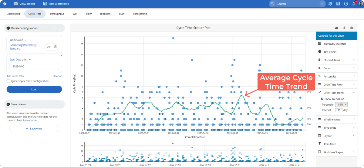 Cycle Time Scatter Plot
Additionally, you can use the Cycle Time Histogram to see your work tasks' most common cycle time length. This chart will help you monitor and control your team's desired pace.
→ Learn more about Cycle Time Histogram
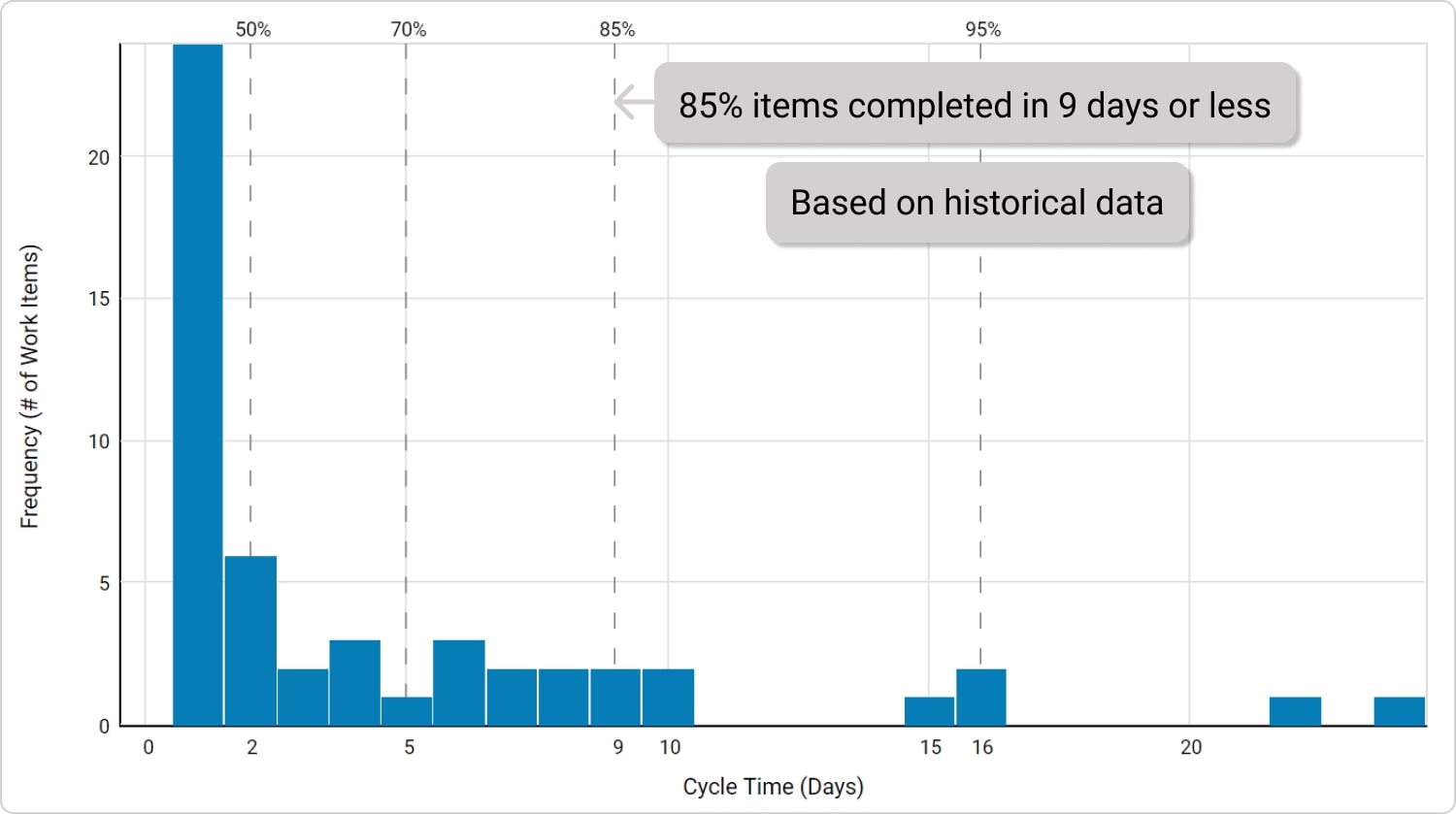 Cycle Time Histogram
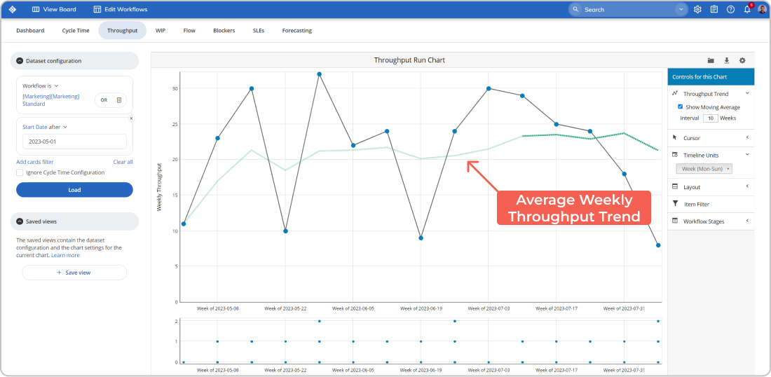
Throughput
Throughput is the number of tasks finished per time unit, such as completed work items per day. It can be named a team productivity metric. It represents the productivity level of your team in the past.
Throughput is an important metric to track because it shows the impact of your workflow on total business performance. An overview of total processed units can help you make important business decisions, such as expanding work capacity, speeding up production, and so on.
However, throughput can be a tricky metric. It shows you the number of tasks that have been finished per day, but it doesn't show you when different tasks were started. This is why, for more precise future decisions, you can combine the throughput metrics with cycle time and lead time reporting.
How to measure Throughput?
You can use the Throughput Histogram to see the average throughput per day or the percentage of all days with a certain throughput. This will give you a better understanding of your team's capacity.
→ Learn more about Throughput Histogram
 Throughput Histogram
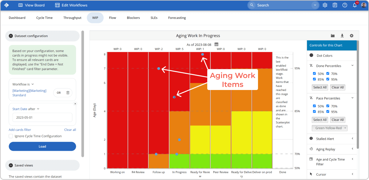
Work in Progress
Unfinished work cannot deliver value to your customers. However, "Work in Progress" plays a crucial role in monitoring and analyzing your workflow's capacity. This is why it is important to track work items that are in progress but not finished yet. By doing so, you cannot only determine your team's capacity but also improve the value flow.
Your kanban board allows you to easily monitor work in progress. The board shows you a quick overview of all tasks in progress and vital information related to each task, such as assignee, deadline, description, and so on.
How to measure Work in Progress?
Furthermore, by using an Aging Work in Progress chart, you can see the sum of all work items that are being processed and how much time has passed since they were started. This way, you can spot tasks that have been in progress for too long and why.
→ Learn more about Aging Work in Progress
 Agile Work in Progress
Queues (The Cost of Waiting)
Queues appear in your workflow while tasks await further action. For example, a queue stage can be "waiting for review." Often, queues accumulate a major part of tasks' cycle time because work items are interrelated and depend on different team members. This is why it is important to track queues and understand how they can impact your overall performance. It is reasonable to limit the number of work items in queues and try to move them as fast as possible.
In Lean, waiting is considered a major waste. Therefore, the longer tasks are spent in queues, the higher the costs.
How to track and analyze Queues?
You can use the Heat Map to monitor and analyze queues. This tool actually shows how long your tasks have in each stage of your workflow. This way, you can see the total amount of time work items in queues reside in a predefined time frame.
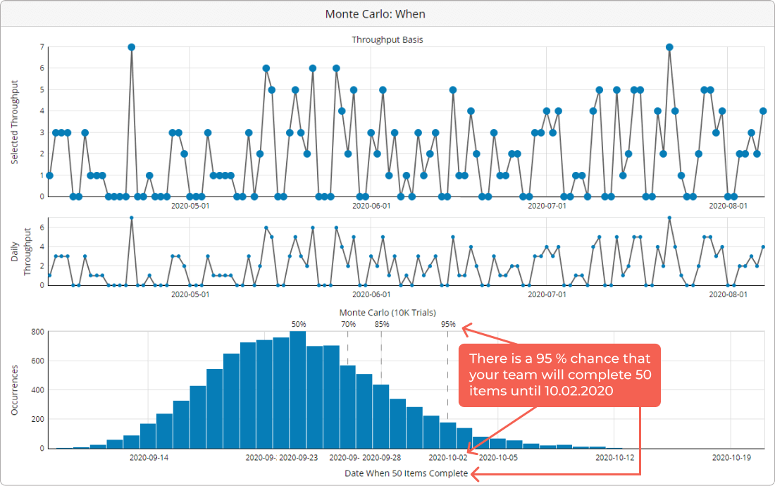
When Will It Be Done?
Wouldn't it be great if your business can answer this question with certainty? Of course, it would. Work estimation has always been a problem, but with Kanban metrics, you can use data-based forecasts to see when your tasks will be done.
Meet Monte Carlo simulations - a statistical tool that can help you make data-driven decisions.
Based on your workflow's historical data, this tool runs through a large number of random simulations to give you a probabilistic forecast of when current tasks can be finished or how many tasks can be completed for a certain period of time.
→ Learn more about Monte Carlo simulations
 Monte Carlo Simulations
These are some of the most important Kanban metrics you can start with to make your team more productive and your workflow more efficient.
Businessmap is the most flexible software
to gain full work visibility across teams & portfolios
How Kanban Metrics Help Teams Improve In Real Life?
"If it is just about visibility, you might get away with any task tracker, but if you want to take it seriously, close the feedback loop and help teams make informed data-driven decisions, then the Businessmap platform is the obvious solution." says Nils Wloka, Director of Engineering in Instana.
No Agile team will disagree that data analysis is essential for a more stable workflow, more informed decisions, and, ultimately, better project outcomes. When these metrics are combined within a comprehensive platform that offers a range of charts and diagrams, they become crucial to the team's success.
Trusted by many teams, Businessmap offers an extensive, powerful analytics module that enables teams to analyze workflow performance, optimize process efficiency, and embrace continuous improvement. Let's explore some examples to showcase the actual outcomes.
Becoming 50% More Efficient with Businessmap
Driving improvement requires constant measurement. Recognizing this, AK Gida's IT department adopts Businessmap's comprehensive analytics suite to assess process efficiency following the implementation of new Agile practices.
Their focus is on flow metrics like lead time, cycle time, and throughput, which provide valuable insights into the IT department's delivery performance.
For instance, the Cycle Time Scatterplot empowers IT engineers to analyze lead and cycle times. The tool helps them estimate how long it typically takes for a majority of tasks (e.g., 85% or 95%) to move through the workflow. This data is then used to establish Service Level Expectations (SLEs) for incoming work items.
The analysis of flow metrics data allows the team to achieve remarkable results, including a 54% improvement in cycle time and a 23% decrease in lead time.
Source: AK Gita Case Study
Doubling Flow Efficiency
Encoparts, a distribution logistics company, transformed its International Purchasing Area by implementing flow metrics like lead time and cycle time. These metrics provided team leaders with valuable insights into the purchasing process, revealing delivery speed, identifying bottlenecks, and breaking down the time spent on various activities.
As a result, the team achieved consistent cycle time and throughput for order fulfillment. Within just two months, they processed an average of 152 work items in a 12-day period. Additionally, by analyzing value-adding versus non-value-adding tasks, they nearly doubled their flow efficiency from 34% to an impressive 67%.
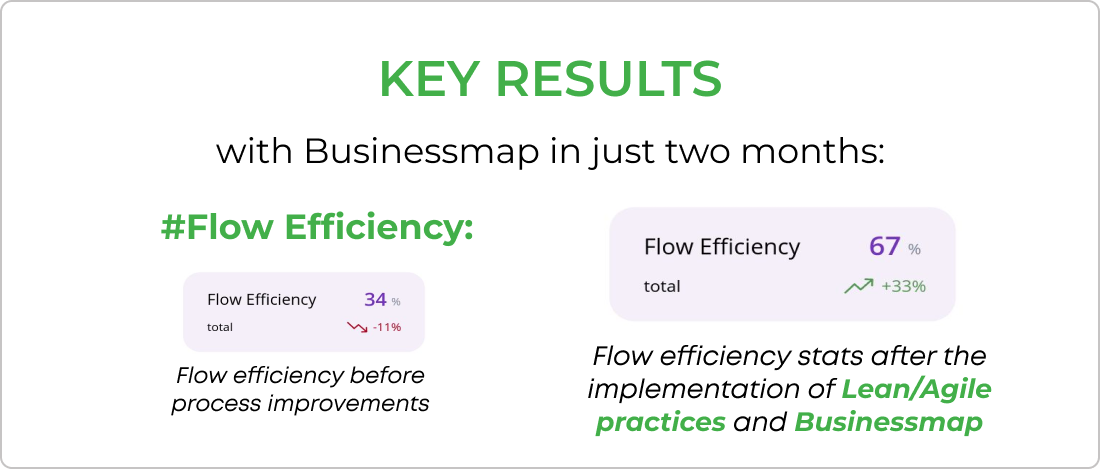
Source: Encoparts Case Study
Cutting Down the Cycle Time More than Double
SCHLENK embraced Kanban metrics like cycle time, throughput, and flow efficiency to better understand and improve their work processes for innovative projects. They regularly used the Cycle Time Scatter Plot and the Cumulative Flow Diagram to identify areas for optimization.
By analyzing the outliers through close examination of the Cycle Time Scatter Plot diagram, they identified the causes of delays in specific tasks and defined optimization steps based on their findings. This approach enabled them to systematically tackle process bottlenecks and remove blockers from their system, leading to more efficient workflows and improved project handling.
Furthermore, by analyzing the Cumulative Flow Diagram, they discovered inefficiencies and introduced Work in Progress (WIP) limits. This change dramatically reduced cycle times, cutting them from 110 days to 44 days at the 85th percentile.
Source: Schlenk Case Study
Businessmap is the most flexible software
to achieve full work visibility across teams and portfolios